Dr. Oto Kano
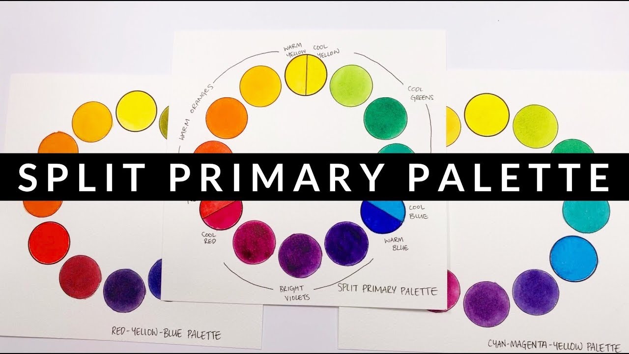
In the second episode of our color theory series, we take a look at what is so good about the split primary palette, as well as hints and tips on how to put together your own split primary based palette.
Find out what colors I recommend for making a split primary palette with paints from Daniel Smith, Holbein, Sennelier and Schmincke.
*** Colors Recommended ***
*** Daniel Smith Essentials Set ***
https://bit.ly/2FGUdO6
Warm Yellow: New Gamboge https://bit.ly/2PWQhxd
Cool Yellow: Hansa Yellow Light https://bit.ly/2zsvdV2
Warm Red: Pyrrole Scarlet https://bit.ly/2S7n2Ey
Cool Red: Quinacridone Rose https://bit.ly/2KwjHwh
Warm Blue: French Ultramarine https://bit.ly/2AnAoW7
Cool Blue: Phthalo Blue Green Shade https://bit.ly/2P1Xt66
*** Daniel Smith Alternative ****
Warm Yellow: Hansa Yellow Mid https://bit.ly/2P2xlI3
Cool Yellow: Lemon Yellow https://bit.ly/2DIydj8
Warm Red: Permanent Red https://bit.ly/2zs1Ylv
Cool Red: Quinacridone Rose https://bit.ly/2KwjHwh
Warm Blue: Ultramarine Blue https://bit.ly/2TKqUwN
Cool Blue: Phthalo Blue Green Shade https://bit.ly/2P1Xt66
*** Holbein ***
Warm Yellow: Permanent Yellow Deep https://bit.ly/2Ql6hbU
Cool Yellow: Aureolin (this one is lightfast) https://bit.ly/2Kyv4np
Warm Red: Scarlet Lake https://bit.ly/2AmZFQg
Cool Red: Quinacridone Magenta https://bit.ly/2P1CvnV
Warm Blue: Ultramarine Blue Deep https://bit.ly/2rcok61
Cool Blue: Phthalo Blue Yellow Shade https://bit.ly/2An5blN
*** Sennelier ***
Warm Yellow: Sennelier Yellow Light https://bit.ly/2TDh6Vz
Cool Yellow: Lemon Yellow https://bit.ly/2OZT9nJ
Warm Red: Sennelier Red https://bit.ly/2R8A18Z
Cool Red: Rose Madder Lake (this one is lightfast) https://bit.ly/2r3x3qR
Warm Blue: French Ultramarine Blue https://bit.ly/2DMUJrl
Cool Blue: Phthalocyanine Blue https://bit.ly/2BxtpLY
*** Schmincke ***
Warm Yellow: Pure Yellow https://www.jacksonsart.com/schmincke-horadam-watercolour-paint-15ml-pure-yellow?___store=jacksonsart_en&acc=46ba9f2a6976570b0353203ec4474217
Cool Yellow: Lemon Yellow https://www.jacksonsart.com/schmincke-horadam-watercolour-15ml-lemon-yellow?___store=jacksonsart_en&acc=46ba9f2a6976570b0353203ec4474217
Warm Red: Scarlet Red https://www.jacksonsart.com/schmincke-horadam-watercolour-15ml-scarlet-red?___store=jacksonsart_en&acc=46ba9f2a6976570b0353203ec4474217
Cool Red: Magenta https://www.jacksonsart.com/schmincke-horadam-watercolour-15ml-magenta?___store=jacksonsart_en&acc=46ba9f2a6976570b0353203ec4474217
Warm Blue: Ultramarine Blue https://www.jacksonsart.com/schmincke-horadam-watercolour-15ml-ultramarine-blue?___store=jacksonsart_en&acc=46ba9f2a6976570b0353203ec4474217
Cool Blue: Helio Cerulean https://www.jacksonsart.com/schmincke-horadam-watercolour-15ml-helio-cerulean?___store=jacksonsart_en&acc=46ba9f2a6976570b0353203ec4474217
Source


any particular reason you recommend the lemon yellow over the hansa yellow light? 🙂
Is it ok to mix and match any of the warm and cool that you have listed from the various suppliers I might have some from DS and others from maybe Turner or WN? Thanks for these videos makes a lot of sense why my paintings look like mud
Great color mixing explanations! Thank you.
By far the most easy to understand explanation of what a split primary color wheel is and WHY you want to use one. I’ve spent days looking for this!! THANKS dr. Kano !🙏🏻 🙂
Hello and thank you for the very thorough explanation of this hotly debated subject. I do have a question which will probably be considered controversial, but… On the CMY color wheel, if you mix a cool red and a cool yellow to produce an orange-red, orange, and yellow-orange wouldn't those colors technically be considered cool? Is cool orange a thing?
thank you ♥ I have learnt a lot!
How do I get my hands on a watercolour paint catalogue like this one? I am always trying to look up transparency, lightfast and pigment numbers online and it is always so slows. Paper so much faster.
Please, I was wondering why is the (more Greenish) Blues closer to Yellow are COOL and the (more Purplish) Blues closer to Red are WARM when isn't Yellow ultimately warmer than Red? I've heard many artists call the Ultramarine color warm like you, but I've also heard some say exactly the opposite and call it the cool one, but I feel you're WAY SMARTER;) Could you please forgive my confusion?
"Passion raising" 😂😂😂🏆
Thanks for your tutorials and Happy New Year !
I bought this Daniel Smith set this summer and really loving it! This video is fantastic and really loving your suggestion for travel pallet layout!
I've added brown as 7th colour. As I always have difficulties to mix it
Thank you! Thank you! I am a fiber artist and I mix all of my own colors in dye for wool. I have been really baffled by the various versions of the primary colors and how to get clear results. The split complimentary is clearly the answer I’ve been looking for. I am eternally grateful.
I wish I had seen this video long ago. Thank you soooo much .You are and amazing teacher I 'v finely untangled my confusion. Thank you againg and againg.
This was a great explanation! Thank you.
one of the all time best color videos. So straightforward, and such a clean explanation of CMY vs RYB and where they excel.
Thank you so much for sharing your knowledge. Your videos are amazing for beginners like me
Your explanation finally made sense of the split palette. Thank you!
I have been studying the split primary palette for a month now, and Dr. Oto's lesson is the best explanation I have seen, heard, or read. Her notes accompanying the video are so helpful. Thanks, Dr.!! You are an amazing teacher.
While I'm new to art and color theory, I'm glad that you made this video and explaining it in detail and so clearly! As a visual learner, your video helped so much! If you have an online beginner class on color theory and art, I'll be taking it in a flash! Thank you so much for your videos, which I just stumbled today!
Thank you very much for this fantastic presentation. I use acrylic for painting but I am sure this applies to acrylic as well.
Brilliant teaching! I wish I had learned this as a child. Children are a lot smarter than we think, there are ways to teach this to kids I’m sure. Thank you!
Excellent video. Just what I was looking for. Thank you
I wish I had found this video 2 years ago 🙁
Thank you for your time and effort to produce such a useful, informative video. Needless to say I will be subscribing and dive into your other videos with glee!
I don’t know why but I used the spilt one but not with the yellow but still it worked fine I don’t know how though
im only getting giorgione watercolor paint set.. like the solid set.. not paste or liquid.. errrr.. there are no names on the colors =))) i guess i just gotta wing it.????? oh damn… being newbie is hard
Omg youve helped me a lot. Im still intimidated with buying so many colors and ive jut got a warm and cool red.. i hated what the warm red was mixing and thought i jist got a bad color. This cleared everything up. Thank you very much
This deserves a trophy 🏆👏🏾👏🏾👏🏾
Thanks for making something that I pretty well understood now become crystal clear! I’m still going to write things out as I’m afraid I’ll be back to "pretty well" in a short time!
I learned a great deal watching your split colour wheel demonstration, Thank you