http://scottnaismith.com
FACEBOOK: http://www.facebook.com/pages/Scott-Naismith-Scottish-Landscape-Artist/107776392866
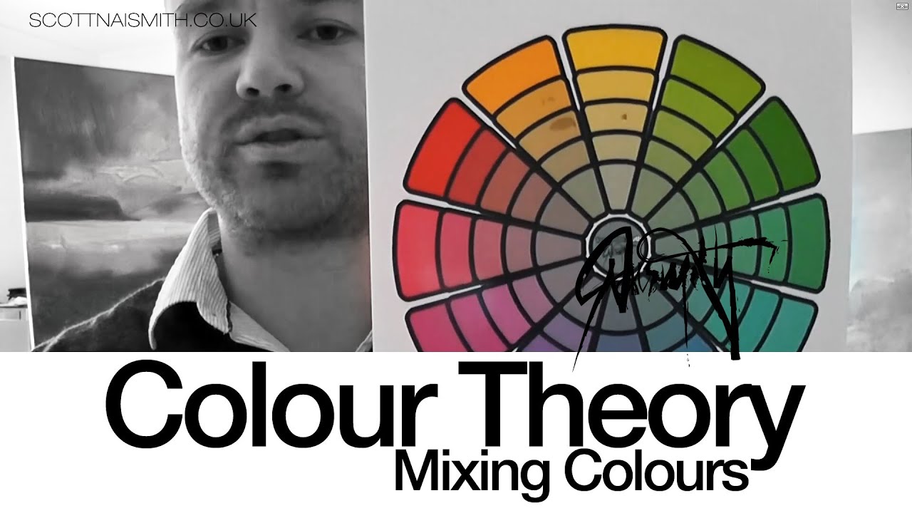
Part 5 of the Colour Theory tutorials from Scottish landscape artist Scott Naismith deals with how to mix paint. More specifically, how to predict what should happen when colours mix by making reference to the colour wheel.
The colour wheel used in this video I have fine tuned and made available on my website at the following link. Free although there’s a button for donation….
http://scottnaismith.com/buy-online/product-category/resources/colour-wheel-for-artists/
Please Note this is a different (newer) site than the one shown in the video
My three previous videos on colour would explain a little more about the subject:
Colour Theory: Hue and Saturation: http://www.youtube.com/watch?v=2rU2Juual18
Colour Theory: The Truth About The Colour Wheel: http://www.youtube.com/watch?v=jQqxN8LpGzw
Colour Theory: Mixing with primary Paint: http://www.youtube.com/watch?v=J6ZAsuiHvTo
Colour Theory:Balance and Harmony: http://youtu.be/KOVXP6ILtrM
http://www.facebook.com/pages/Scott-Naismith-Scottish-Landscape-Artist/107776392866
Scott Naismith
Source


Your colour theory course is by far the best I ever seen. Great work!
THIS BLEW MY MIND!
Huge thanks, Your videos are great!
keep up the good work 🙂
Thank you so very much for sharing what you know!! I am trying to teach myself.. and I needed you!!
Scott, thank you for the video and for the color wheel (I sent in a donation….smile). I am trying to match my colors to the color wheel before I start to make one for myself (for better understanding in the doing). One of the greens on the right you mentioned it was" a mid-green or Meridian Green". Do you have any other name that you could name because Dick Blick does not carry that. Same for Magenta. Please suggest a color for that spot on your color wheel. Many thanks!!! Roena
thank you very much for your video, you deserve more views in your videos!
Excellent work Scott. I'm in the middle of my colour education programme & really appreciate your take on Cyan & Magenta, I'll be doing some playing for myself making charts & the like. Before doing this I'm also keen to know what you consider to be a true yellow. From other materials I've been guided on a Yellow/green bias = Lemon Yellow & a Yellow/Orange bias = Cadmium Yellow BUT these once again fall into the colour bias group, whats your take on this?
I love this!
Excellent thank you.
Great tutorials Scott – wish I had known about you and your work before I was in Scotland last June as I would have loved to check out your work in person!
I can't praise you enough for these wonderful tutorials.
Great tutorials, thanks so much. Although you are actually talking about the CMY system, I wonder why you don't use the pigment reference numbers rather than colour names of paints? Manufacturers use different mixes of pigments for some colours, so say two Ultramarines may actually be different colours.
Excellent! Thank you for not keeping this to yourself 🙂
Thanks pal for sharing!
awesome video
Everything I thought I Knew…gone down the toilet..sigh..I love your videos…so exciting to learn something new.
thank you! I know its 2 years later, but I just found you and I'm eating up all of your information! It's important for moms of 5 who don't see art school in their near future…THANKS SCOTT!
don't know if he mentions this, but printing on photo paper would help keep the colors bright and on the surface.
Great, thanks!
+Scott Naismith How many colours do you use in a typical landscape?
NOTHING , SPECIAL.WE KNOW THAT ONE 100 YEARS AGO …
Thank you !!!!!!
so if you mix blue and yellow, you should get desaturated blue, or desaturated yellow right? so if i do it, why does it end up green?
If mixing within the same primary-to-primary-third of the circle gives you no decrease in saturation but mixing between different thirds does, wouldn't it be more accurate to represent colors in a triangle with the primary colors as its vertices and all the saturated ones on the edges?
Nope, I don't understand. When I mix red and green I get brown. I can't see brown anywhere on your colour wheel. (deep brown).
I hope I'm not being stupid, but this wheel is all about desaturation, right? How did you produce the desaturated colours on the inner ring – was there a regulated method for it? What are darker colours – dark reds etc? Or is that in a later video? Sorry to be dense…
You say to "KNOW THE TRUTH" so, here it is…
The "primaries" of the Visible Spectrum are NOT PRIMARY because light waves do not mix. The conflation of "mixing" is in Biology.
Because of the way our biology works we find that Spectrum RGB are PRIMARY IN LIGHT for us…
Because of the way our biology/light reflectance/physical matter pigments work, we find that Spectrum RYB is PRIMARY IN PAINT.
Because we have no perfect pigments we find that each is influenced by all 3 primary's but the ones we would put out as starting primary's on the outermost part of the wheel are high value/chroma of a particular RYB dominance or a particular dominance of 2 of the 3.
We know that every pigment has a MAJOR (as in a dominating second primary HUE between the other two) bias towards another primary other that what PRIMARY SPECTRUM HUE it tends to be.
We know that every time we mix pigments we get a better and less desaturated Value/chroma if we mix them towards the primary bias and a lesser high saturation when we mix the other way because we have introduced more influence of the third primary where it once had a lesser influence and we know what happens when we mix all 3 of them together.
We know that any pigmented HUE used to represent RYB is an imperfect example for everyone but necessary for the purposes of Basic Elementary Theory Instruction and the closer to Middle Neutral Spectrum Hue the example is, the easier it is to teach it and the brighter the better because that's what the kids like.
We know that a SPLIT PRIMARY SYSTEM is even more accurate and necessary to the instruction in higher education. We know that we need the highest Value/Chroma pigments in each of the Major Primary and Secondary and Tertiary positions to make the most Hue's possible for us in the Color Spectrum (both real and imaginary).
We also know that the Transparent CYM choices of pigments is the CHOICE OF MIXING PRIMARIES for the PRINTING INDUSTRY and for those who choose them to be their "firsts". This is the ONLY WAY C&M become primary. Again: What is "primary" to human biology is RGB in Light and RYB in pigment.
We also know that your color wheel and theory Model makes the teaching of Color Theory in pigments even more confusing and inaccurate over the Standard Model. You are actually causing confusion with your conflations. Only ONE SECONDARY OF LIGHT has become NECESSITY to become PRIMARY IN PIGMENT…not all 3 of lights Secondaries of OUR RGB VISION. You probably should not be feeding "tidbits" of GLAZING PROPERTIES to these kids when you are teaching standard paint pigment theory. The two are not exactly the same as light plays a more prominent role in glazing over white back grounds. I wonder how many kids walked away from this thinking that they could simply glaze over anything and achieve CRL.
I like your work but not your theory. We are still bound by the Laws of Physics and the Laws of Biology-even when our brains see otherwise when it can't quite properly decipher unmixed light in the intermediary Red to Violet (purple) range. But we see what we see and it is useful and necessary for us but by no means does it make "magenta" and cyan primary in Theory.
Excellent
Shouldnt yellow be opposite purple? It is on other cmy colour wheels. Can you demonstrate mixing blue and yellow to make a grey – not green. Thanks
Oh yes, I’ll try your method. I’m open to modern ideas. Especially if it cuts down on the number of colours I have to invest in.