artandfilm21
Artists of the 20th Century Art Documentary Series.
Episode 13 Paul Klee
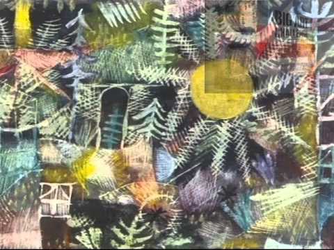
Paul Klee was a Swiss-German painter. His highly individual style was influenced by movements in art that included Expressionism, Cubism, and Surrealism. Klee was a natural draftsman who experimented with and eventually deeply explored color theory, writing about it extensively; his lectures Writings on Form and Design Theory (Schriften zur Form und Gestaltungslehre), published in English as the Paul Klee Notebooks, are held to be as important for modern art as Leonardo da Vinci’s A Treatise on Painting for the Renaissance. He and his colleague, Russian painter Wassily Kandinsky, both taught at the Bauhaus school of art, design and architecture. His works reflect his dry humor and his sometimes childlike perspective, his personal moods and beliefs, and his musicality.
http://www.tate.org.uk/art/artists/paul-klee-1417
http://www.standard.co.uk/goingout/exhibitions/paul-klee-making-visible-tate-modern-exhibition-review-8900715.html
https://www.questia.com/newspaper/1G1-81897307/walking-the-line-from
http://www.dailymail.co.uk/home/moslive/article-1259247/BRIAN-SEWELL-Ten-greatest-painters-changed-world-art.html
Brian Sewell Big Art Challenge UK Art Prize Full Series:
https://www.youtube.com/watch?v=azZUF4eVaIk&list=PLTRal7R3G0f-SI4XoSByxArBodGDHHupR&index=6
Understanding Contemporary Art Full Course:
https://www.youtube.com/watch?v=GYQIK-gbo8w&list=PLTRal7R3G0f8E9rOf82XbZiBhL6IxzDCJ&index=1
Art After Metaphysics:
http://www.amazon.com/After-Metaphysics-John-David-Ebert/dp/1492765481/ref=sr_1_1?ie=UTF8&qid=1450485945&sr=8-1&keywords=art+after+metaphysics
Naked Emperors: Criticisms of English Contemporary Art:
http://www.amazon.com/Naked-Emperors-Criticisms-English-Contemporary-ebook/dp/B00JOS49TC/ref=sr_1_3?ie=UTF8&qid=1451990337&sr=8-3&keywords=naked+emperors
Source


my favorite artist
A very clear and helpful documentary. The pictures were chosen to give a wide and eclectic show of his works. Thank you.
Would you now edit it by removing the very out of date advertisement, which blocks so much of what we want to see. Then whilst you’re doing that perhaps you will please include for the correct pronunciation of the artist’s name.
It is so cheap and mature, showing a naive application of research. I’m sure you don’t want to be known for such an omission in your hard work.
Oh dear, Paul's Spirit 😢 is in tears.
geeez, it really would not have hurt to get the pronunciation of at least the artist´s name correct….
It's worse than I can believe, like playing a symphony with an overlay of rap.
Are you people art lovers or just money seekers? Who would stick an ugly logo in the corner of beautiful art? People see your name below the video, what bad taste.
Love the figures. Just so unique and whimsical.
must be uncultured this shit boring af lmao
Unwatchable with the advert. Completely defeats the point of advertising if you switch off immediately. No?!
ART & FILM FUCK YOU AND YOUR AD,,,,,,,,ASSHOLE
How you make a whole documentary and say the man name wrong tho
Why don’t you, remove this awful video with the shitty advert in the corner and upload it afresh. Maybe someone will actually like it then.
A&&F 21 FUCK YOU !
What is the name of the piano music that begins the documentary?
The advert at the corner stings..!!
What is this big sign in the corner? Remove it!
Really enjoyable.
Could you brexit the add ?
Keith harring and jean michel basquiat copied
Why that stupid Big Art Challenge advert all over your videos? Just totally self-defeating in terms of allowing the viewers enjoy these uploads.
Fuck you and the ad in the right corner. You've ruined this!
Thank you for this documentary, but It is really tasteless, if not a sin, to put that top right crap over art of this caliber.
Pronounced more like "Clay"
I’m out of here – that add top right –
this jumble of "yuk" not worth the time to watch.
Have you learned nothing? No one likes your huge ass watermark in the corner. There is no need for it to be that big. I'm finding a different channel.
Never watch again because of the ad in the top right of screen
Kleeeeeeeee! No, Klee (as in clay!). Please, at least pronounce Klee correctly….
North Africa…… precisely Tunisia!!
COULD YOU BE MORE CRASS WITH THE ADVERT IN THE RIGHT CORNER???????
I USED ALL MY PATIENCE TO OVERCOME THIS FOR THE ART YOU BOOB !!!!!
This is not the way to watch a documentary. To much ads. Poor text in the voice-over.
I believe that if Klee were alive, he'd scoff at all the explanation on each piece. It gets ponderous, pretentious, and presumes to know what Klee's intent was. A little less blah, please. and the add at upper right? beyond annoying.
The
this narrator's voice transforms art into a soft bowel movement."Masterpieces are accompanied by aggression."
I Have A Paul Klee Left To Me By My Great Grandmother The Drawing Is Called At The Trout Brook. I Have Look For This Drawing And Can Not Find It Any Where. Can Any One Help Me. Thank You Very Much
Good content, annoying ad on the right side, abrupt ending. 6/10. Still enriching.
a highly entertaining and educational presentation–great tempo with a veritable cornucopia of Klee's inspirational art to enjoy
This may one of the worst documentaries I've ever seen. Monotone voice and not nearly in depth or analytical enough. Poor reproductions. This is a bush league excuse for a doc. Not to mention the ads obscuring the film itself.
Not Klee as in key. Klee and in clay.
impossible to enjoy this
ditto on this being unwatchable with those annoying adverts.
why the top right image? Is a documentary about Art! visual part is 100% relevant
Really annoying adverts in top right across the picture frame……seemingly no way of clearing them – any ideas ? Looks like an excellent documentary but had to stop watching it as the visual interference from the 'ads' was too distracting.