The real action kicks in at around the @23:30 mark. I had some issues with Photoshop freezing up at first, so jump ahead to that point to get right to the good stuff. Or just watch the first portion to hear me ranting and complaining about my computer, either or.
A 2-hour live tutorial I did on Ustream back when I had an account with the service. I had re-uploaded it to Livestream, and now that Youtube lets us host longer videos, I finally can post it here. Keep in mind that in the video, I do answer questions that were being asked in the chat room at the time, but the feed only recorded the Photoshop window, so I don’t have a record of the exact context of each question. But I did try my best to repeat each question before answering.
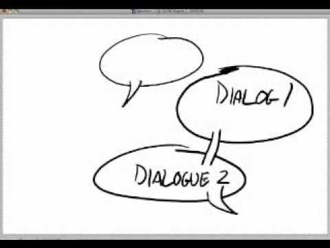
This tutorial covers the basics of comic design and theory. I try to cover all of the main areas, including proper panel layout, leading the eye around the page, gutters, word balloon placements, and a number of other topics. I wanted this to be a pretty thorough crash-course for people who wanted to get into making their own comics.
This was done during my online art show, The Inking Room, which is co-hosted by myself and my wife, Whitney. We are both former students/graduates of the Savannah College of Art and Design. I have a degree in Sequential Art and am the author of the comic Peter and Company.
The Inking Room official site: http://www.jonponikvar.com
Livestream channel: http://www.livestream.com/theinkingroom
Twitter: http://www.twitter.com/jonponikvar
Peter & Company official site: http://www.peterandcompany.com
Jon Ponikvar
Source


Lol
THX U MY GOD I BEEN TRY TO FIND SOME LIEK THIS FOR MOUTHS
heeeyyy! just got around to watching your tutorial. It was really good – so many tips!!