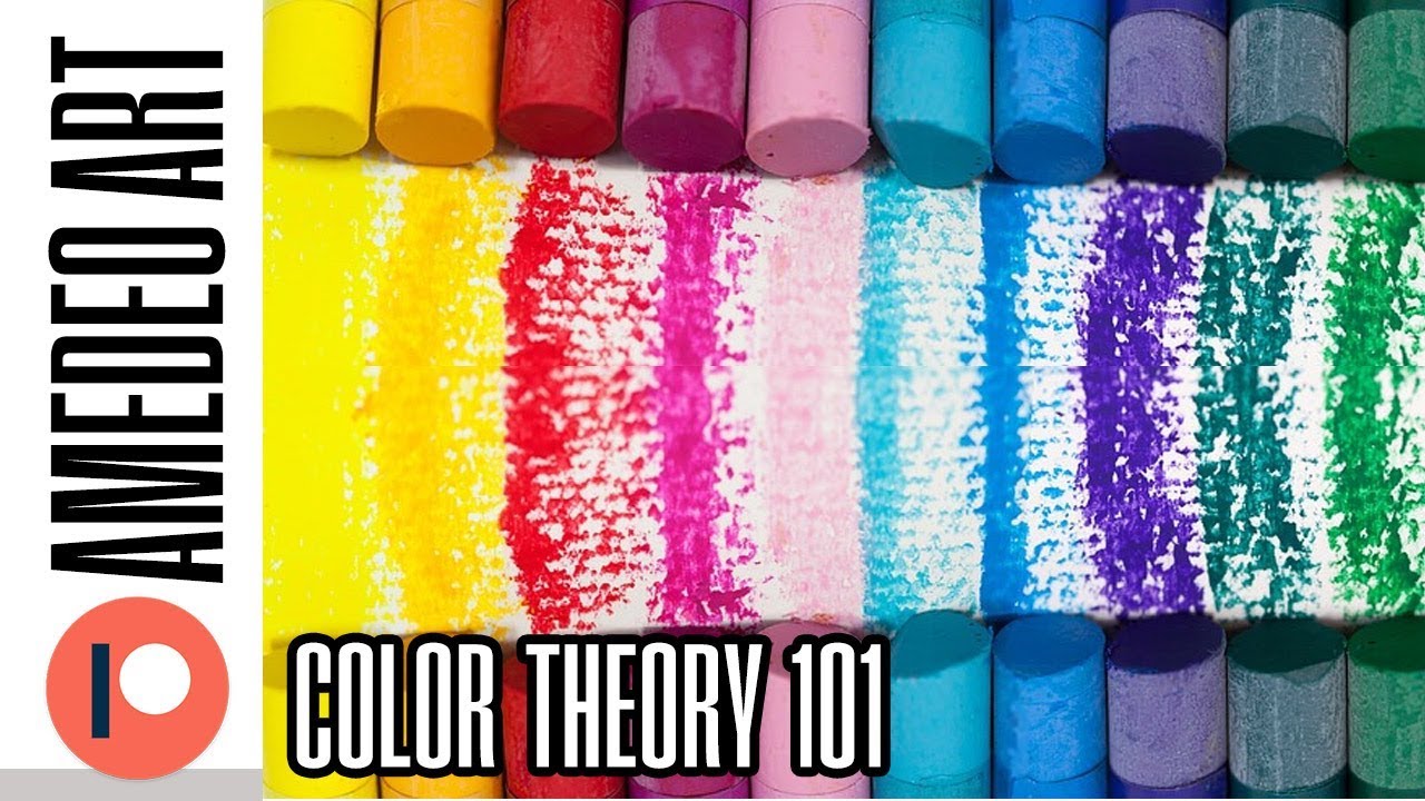
Kate Amedeo Art
Hey guys! For those of you who love exploring color, I have made this video about color theory. Here is a list of all the things we will see. Hope you find it useful!
Primary colors:
Colors that cannot be mixed from other colors, yellow, blue, red / magenta, cyan.
Secondary colors:
A color resulting from the mixture of two primary colors
Tertiary colors:
A color resulting from the mixture of a primary and the secondary color.
Neutrals
Temperature:
Temperature is the relative warmth or coolness of the color. Warm hues: red, orange, yellow. Cool hues: green, blue, purple. But even warm and cool hues can have warm and cool versions.
Value:
Value is the degree of lightness or darkness of the color. Tint – mixes with white, shade – mixes with black. Tone – mixes with grey.
Intensity also called chroma or saturation of the color:
It’s the degree of purity or brightness of a color. Low-intensity colors look duller and greyer, high-intensity colors look brighter. The extreme of low intensity is neutral grey. It’s very important to remember that once you have lowered the intensity of a color you will not be able to return it to the original hue.
Color schemes
Complementary colors:
It’s amazing how colorful art can be when using just two colors opposite each other on the color wheel. These colors look much brighter side by side because they possess the most dynamic color contrasts.
In wet media the mix of these colors will be neutral, meaning grey.
Near complementary colors:
Instead of direct complements in this case a color next to the direct complement is used. If mixed in wet media these colors result in more vibrant colorful mixes.
Split complementary colors:
Split complementary color schemes comprise three colors, one color and two on either side of its complement. Using split complementary colors will add more color to the artwork but will still maintain it in harmony.
Analogous complementary colors:
First, let’s talk about the analogous colors, these are colors that are next to each other on the color wheel. No matter how many colors you use it is very important to establish the color relationship from the very start of your work. The analogous complementary color scheme means one color + it’s complement and its two adjacent colors. The analogous colors are usually dominant in a given artwork and the complement enhances the effect of contrast. It’s very important to establish the dominance of the analogous colors because otherwise, the artwork can have a very imbalanced appearance.
Patreon: www.patreon.com/kateamedeo
Source


This is the first time I’ve understood this, you have explained it beautifully thankyou
This is the best explanation of the color wheel I've seen! I have one but am going to watch this again and make one along with you! Thank you Kate!!
Not only an amazing artist but also a great teacher!
Fantastic!