MOLLY’S ARTISTRY
Playing with Color Theory / CYM vs. RBG / Dutch Pour / Acrylic Pouring / Fluid Art
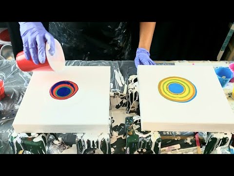
So I watched this video by Echo Gillete and the colors she discussed in her color theory video inspired me to try them out in a painting! You can find her video here. Now there are multiple things at play here; the consistency of the paint, the colors used, and the way I layered the paints in the puddle. I am still not sure if i like either painting. Let me know what you guys think!
Echo Gillete video:
https://www.youtube.com/watch?v=NVhA18_dmg0&t=431s
Canvas is a 10x10in
thank you to all that have supported my channel! If you would like to donate, you may use the link below, every little bit counts so that i may make more videos!
https://www.paypal.me/mollysartistry
KS resin coupon for 5% off = mollysartistry
Molly’s is an affiliate of ks resin and receives a commission on purchases at no extra cost to you!
ARTEZA COUPON CODE: MOLLYSARTISTRY12
Code is good until march 31
Arteza links
Us: http://arteza.com/?a_aid=Youtube_Mollysartistry
Europe: https://arteza.co.uk/?a_aid=Youtube_Mollysartistry
Molly is an affiliate of arteza and receive a small commission on the sales at no extra cost for your customers
Colors: sky blue (arteza’s version of Cyan per echo), magenta, mid yellow, brilliant red, phthalo blue, and mid green. White for the base.
PM: floetrol mixed in a 1pt paint, 2 parts PM plus water for consistency if needed
My Amazon store front for pouring supplies:
US: https://www.amazon.com/shop/mollysartistry
Canada: https://www.amazon.ca/shop/mollysartistry
Molly is an amazon affiliate and receives a small commission on the sales at no extra cost for you!
If you would like to support me
https://www.paypal.me/mollysartistry
Find me on social media:
https://www.instagram.com/mollysartistry6
https://www.facebook.com/mollistry
https://www.pinterest.com/mollysartistry
https://www.etsy.com/shop/mollysartistry
.
#dutchpour #abstractart #colortheory
I am a south florida based artist. Please feel free to reach out if you are ever in my area, I give private lessons! I also give private video lessons! Email me at mollysfluidart@gmail.com
Source


If you had put your CMY on a black background you would have truly seen their true beauty.
RGB colours are used in LED lights… They're too dark to use when painting.
I thought they looked better before you blew them out. I think the.cells were looking nice. Maybe you would like it better just letting it spread out and make cells.
R. T
SPIDER-MAN VS HULK!!!!
I do like green. But stopped using it ..blends too much with yellows and blues.
Went to school for graphic design. Worked as a photo lab manager and ink cartridge refills. The cmy is most widely used. Color theory involves color wheels. Interesting video though. What you find visually attractive…Creative minds see color uniquely. Hands on art differs than machine computer ink print. And Photo processing
Sorry, not a fan of either
Photography = CYM. Computer (light) uses RGB. Pigments = RYB
Mixing with pigments is very different from mixing with light. Some artists use a double primary color wheel so that they have pigments that lean in different directions. so you would have yellow pigment that leans green and yellow pigment that leans orange. Likewise a hot red and a cool red and two blue pigments one that leans green and another that leans purple.
Say you wanted to mix orange. If you wanted a clean orange you would use the yellow/orange and the red orange. If you wanted a dirty orange you could use the green/yellow and the blue/red.
Neither, but only because of the colors
None of them really mixed together, I'd guess that it's because of the pouring technique or colours or something. I've done a dirty pour with CMY which cane out great, made all colors of the rainbow ^^
So I tried the printer color theory with a colander. My paints were a little thin and got many colors but it muddied up after the colors continued to flow together. Just color, flowtrol and water. Here's a look at it. I guess a theory is what it is.
https://photos.app.goo.gl/uDVjGzUaqbXoCjQy5
I have taken a lot of art classes in college and was always taught the primary colors are red, yellow, and blue. Their reasoning is that there are no colors that you can combine to make those colors. But green can be made by adding blue and yellow, purple can be made by adding blue and red, orange can be made by adding red and yellow and so on.
Funny thing, I just watched that same color theory the other day. Hmmm. Thanks
It is always interesting to learn about the colour theory… you are super informative and you are and always have been very honest about how you work! Thank u for taking the time out to share….. 💞
I agree with you about not loving either. So much or color theory!
Hi sweetie I actually like the green and yellow pour , to be honest green isnt my favorite either but it did turn out vibrant and I like the composition? So I think we are our worst critics of our art but I do like the green its vibrant and looks coo!! But very interesting about the primary colors?? Thx again hun and I do love both but the green really is vibrant and pretty! 💖👍🎨🤗
Cyan Magenta and Yellow are the digital primaries
Molly, I’m loving that you are doing videos about color theory. Color is the most important tool we use as Abstract artists!
Green and blue together #alldaylong! They’re my favorites. 😀
Sorry Molly, those colors aren't very compelling. The brighter color one is fair but better than the second. You are awesome though.
I watched the video yesterday and am still trying to find pieces of my brain that splattered everywhere. How can I be this old and never questioned or thought about why a printer doesn't just have red, blue, and yellow. I've changed MANY toner cartridges in my time! It is so interesting, to say the least.
Very interesting Molly, enjoyed this video as always! It did make me think…made me think I don't care for Cyan & Magenta! 😆 Love the other colors though! Miss your normal white paint mix, this was different. Keep up the great work, videos and beautiful art! 💚
I think you might have been more happy with the sky blue/yellow/magenta one if you had used cyan. Just a theory. But thank you for showing your experiment. 😊