bretmwxyz
Support me on PATREON: https://www.patreon.com/edensthings
Make a one-off KO-FI donation: https://www.ko-fi.com/edensthings
Follow me on TWITTER: https://www.twitter.com/edensthings
Watch me Streaming on TWITCH: https://www.twitch.tv/edensthings
and that SHOP I mentioned is https://www.thenerdyqueer.com
—
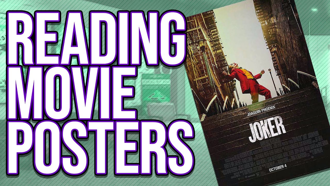
A lil bonus video regarding Semiotics, lets have a look at some movie posters!
—
Huge thanks to the continued support coming from:
aiyekara
Alex Bryson
Askeptosaurus
ayeforscotland
Ben Doran Burke
brynnie
Courtney MOWER
detectiveberry
doulegg
Elizabeth Rosenberg
Ethan Safron
hellolovelyscientist
Horse Of Many Names
Jess Anson
jesusthecookie
Karl Raade
Mattie Rose
mettcon
mixeyclay_phioneleauge
moleminrising
morganmaccallum
Mulloy
neuroticanarchy
ransomtime
Rebekah_solarwillpower
shasta5000
shishikushiro
somedingus
stay_hydrated_bot
tetronomicon
The Magpie Magus
thelokenfurry
threelettermax
umbreonlibris
vinikyu
weeharleycat
whatwouldjedido
whoamattberry
Will M.
wrentangible .
Reading Movie Posters (Semiotics Bonus Video)


first! also, some more excellent content by bretsufudjdkks
GO WATCH MOONLIGHT
I loved it. I’d like to see more.
For the Avengers poster, I’d also add that the pose of looking to the side is reminiscent of statues from Roman and Greek antiquity where heroes, Gods, and leaders are frequently shown contrapposto.
I see the space between the buildings on the Joker poster more like a hole, he is stuck in. I don't feel that the buildings look any inviting, they give some claustrophobic vibes, contrastet by the light background. But the joker, standing on stairs has the opportunety to escape from that hole. It also looks like it's quoting "singing in the rain".
yes !!! this is very good! especially because the small text on the moonlight poster says "this is the story of a lifetime" it's definitely gonna be focused on one character's life.
i've also seen discussion around how poster art differs from DVD cover art particularly for kids' films, because posters have to be aimed at the parents who will take the kids to see the film whereas DVD covers will be aimed at kids who see them in the store and ask their parents to buy it. it's really cool stuff!
This poster for Legend (1985) https://image.tmdb.org/t/p/original/6n3PQSYpZRK5YPk2w8JEwED7AZk.jpg
Large being shrouded in darkness holding the light that is casting a young woman and man and a unicorn, defiantly signifies to me the being is the villain. Also that the 3 figures in the light are going to be victims of said villain in some way.
C
For Joker my immediate impression was that he is in a spotlight.
The people in the buildings are a stand-in for the "normal" people watching him.
He's in front of downward stairs but he's not careful and is looking up instead of down.
So that's a very viceral way of making the viewer feel anxious. I think everybody can
relate to the fear of falling down stairs.
Without the stairs it could be a movie about a theatre actor or circus performer.
But the stairs take up almost half of the poster. So the trajectory of that persons
story is clearly downwards and dangerous.
U LOOK GREAT TODAY!!!
Also amazing video once again!!
Hair on point today
You look great today, sorry about earlier.
My take from the Joker poster is that he's alone. The two buildings show that he lives in a city amongst many people, but despite that he is alone. I also take away the pose signifying that he is not a normal person.
On the joker poster: I first noticed the negative space. To me the joker also occupies very little space on the poster. I interpreted the picture as him being trapped in the negative space between the two apartment buildings(which could symbolize society and more specifically lower class struggles) but at the same time he is dancing. His body confeys a lot of energy and his one fist is almost punching out of the negative space, breaking his confinement.
And then also we are looking up at him from a lower stair. That makes him seem more powerful, despite being so small. That to me evokes a stage-like feeling,that is very much in line with what it felt like to watch the movie. In the movie you are not feeling with the joker like in so many other movies. You are observing his ascension out of his misery through madness.
What's the link to your shop?
Is Moonlight about that guy growing up? I noticed that in the rightmost segment of his face there's a beard.
That moonlight poster analysis is really interesting bc yeah that's the movie in one. Good posters do a lot!
What's interesting about the Endgame poster is that Captain Marvel has equal prominence to Thor and Black Widow, but she's barely in the film. Meanwhile, Banner is relatively in the background despite playing quite a major part. Odd choice.
EDIT: yes, I know, don't reference the film itself, only consider the poster. It's just interesting.
https://upload.wikimedia.org/wikipedia/en/e/e5/An_American_Werewolf_in_London_poster.jpg Half the image being taken up by a black sky aside from a full moon and helps sell it as a horror film by evoking a sense of agrophobia, and sells it as a werewolf movie. Two protagonists depicted suggest tale focusing on two people trying to survive a werewolf attack, although given how much more the one in the red coat stands out against the background we can presume that he's the core protagonist of the two of them – All in all, the poster seems to be selling an entirely different werewolf flick to the one they actually made. (So much easier when the question is framed as "What is this piece of media saying to you" than "How does this piece of media evoke <specific emotion that you may not experience when looking at it> in you." as it was in year 9 media studies)
I wasn't able to find the poster I actually I wanted to do this exercise on (The UK watership down poster, for some reason I'm more familiar with the US one and I believe WD is a case where the two differ) but I did instead stumble upon the most hilariously wrong piece of writing on any film I have ever seen. Not a review. Not an opinion piece in the usual sense (Afterall, as you point out, opinions on art aren't wrong), but the BBFC classification report for the thing. "Animation removes the realistic gory horrror" and "it could not seriously trouble [children] once the spell of the story is broken" are the particularly Interesting quotes from it – https://www.bbfc.co.uk/case-studies/archive/watership-down
I could watch a couple hours of just this @.@