Kendyll Hillegas
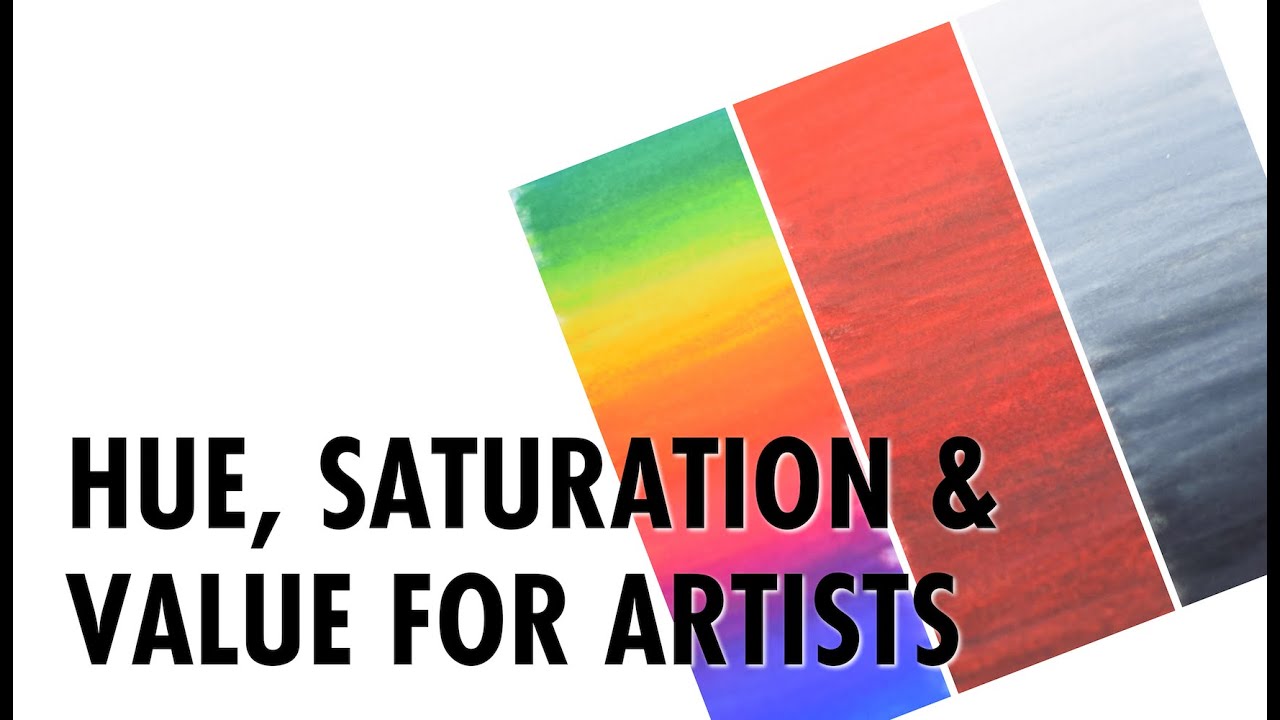
Today’s video is an overview of some basic art terms related to color theory: Hue, Saturation and Value. We’ll cover what each term means and how it functions in traditional art. This is 101 level stuff for artists and illustrators, but it’s so important!
Support me on Patreon: www.patreon.com/kendyllhillegas
Artists Featured (in order of appearance):
Missy H. Dunaway – http://www.missydunaway.com
Wayne Thiebaud – https://en.wikipedia.org/wiki/Wayne_Thiebaud
Kari-Lise Alexander – http://kari-lise.com
Rodrigo Luff – http://www.rodluff.com
Henri Matisse – https://en.wikipedia.org/wiki/Henri_Matisse
Kevin Peterson – http://kevinpetersonstudios.com
Martine Johanna – http://martinejohanna.com
Erik Jones – http://www.erikjonesart.com (If you search for him, be sure to search for “Erik Jones Artist” as there is a Nascar driver with the same name!)
Tran Nguyen – http://www.mynameistran.com
Fuco Ueda – http://www.fucoueda.com
Othon Friesz – https://en.wikipedia.org/wiki/Othon_Friesz
Filmed with:
Camera – Nikon D3300
Lens – Nikon AF-S DX NIKKOR 35mm f/1.8G Lens
Follow me:
Website – http://kendyllhillegas.com
Instagram @kendylln – http://instagram.com/kendylln
Tumblr @kendyllhillegas – http://kendyllhillegas.tumblr.com
Twitter @kendyllhillegas – http://twitter.com/kendyllhillegas
Facebook @kendyllmadeit – http://facebook.com/kendyllmadeit
Music:
“Little Idea” by http://www.bensound.com
Source

This was really helpful thank you 👍
Thanks for this explanation my 12 y/o self needed to understand this because i really wanted to try and color my OC better as im really bad at these stuff :3(new sub for u)
suppose i was more focused in expressing with colors and the painting, it's almost finished and i feel the values in certain areas need to be changed what should i do? do i repaint with color and value in mind this time. or is there a simpler way to fix the value of certain parts without messing up the color?? please help
Thanks that was really helpful even for photography
Thanks for the video. am a bit confused. I feel a saturated red color will appear darker in a gray-scale image. So, gray scaling does not completely remove saturation. I am trying to wrap my head around HSV convention. I see a sign in a street, i can immediately say, it is yellow (hue). I can then state, whether it is pale yellow or has a lot of yellow in it (saturation). If i see the sign in a sunny day, it appears brighter compared to a cloudy day (value). is this correct ?
Hi Kendyll, Thank you so very much for the video. I am a self learning/training artist and this video came on the right time in my learning process since I am trying now to focus on understanding the importance of the shape and form of subjects when drawing to make it more realistic. One day I would like to see myself draw subjects from real life as realistic as possible. Can you please give me your advice on what should I practise or develop my knowledge in if I want to become a illustrator (medical) besides training on my artistic skills? (I am a science student so I do have hold on the anatomy and scientific terminologies but I am not sure what Subjects I should draw and practise to become medical illustrator 🙁 ) Any words from you will be a great help for me at this moment.
And Thank you for all your videos. Your work and all your videos are such an inspiration to me :). Also My hearty congratulations on your new and exciting journey as a New Mom. 🙂 Hugs- Priya 🙂
you are just awesome, thank you!
Hi Kendyll, Thanks for the video. Also thanks for mentioning that art is still doable even when we are not particularly skilled in all aspects from the beginning. I sure have no good hold on colors to work in tandem, better in composition though, but I am still working on it, thanks to your constant reminder that we can work on it and get better at it! Could you share a tip on if it helps to have reference drawings/art for sample textures. I find it confusing because some colours granulate and some do not. When I want to make a piece it gets unreliable..
Thanks for the video Kendyll, really explanatory and clarifying! I'll be sure to bookmark it to reference it when I need to 🙂 You told me about the eyes squinting tip sometime ago in a comment…
absolutely loved this video!
Thanks for the breakdown, super helpful and really interesting to hear your perspective!
This is such a well-informed and well put together video. You did a really great job of explaining these three important terms in a way that's very easy to understand!
I remember being told about the squinting trick, have you tried crossing your eyes as well? I feel like I remember being told that squinting was great for value, but crossing your eyes was good for color. But I'm not so sure now, lol
(By the way, it's so great that you list all of the artists featured. I know a lot of them, but some of them are new and great to learn about)
Another great way to see lights and darks more clearly is
if you're nearsightedtake off your glasses (or just look over them). It works great for me!Thank you, this is very helpful!
Hi Kendyll, since I've subscribed to your channel I've learned so much from you, and for the last couple of months you've inspired me to keep on going with art, and to take it a little bit further from my sketchbooks, posting in my abandoned blog, and starting to create videos hehe ❤️😊 greetings from Chile
Thanks! This was very helpful.
Thanks for this video. I learned something new. Since I paint only digitally, correcting the saturation level simply involves choosing the right saturation and painting over the previous one. One method I know digital artist often use, but I don't since the app I use doesn't have layers, is to paint the first layer in light and dark, and use another layer to apply the colors. I'd always assumed that they would simply choose a flat color and the saturation levels would be automatically taken care of when light and dark values mixed with the colors.