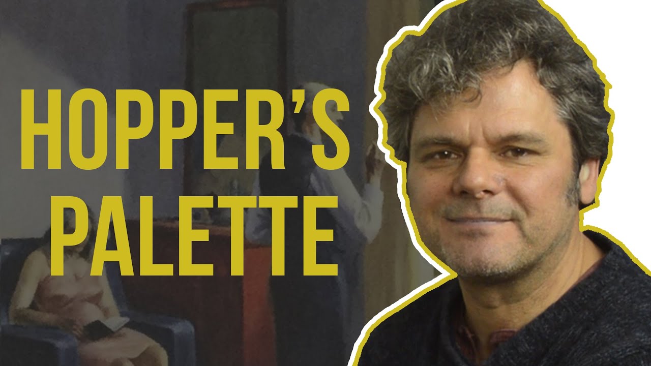
Great Artists Steal
Edward Hopper is known and loved for the mysterious atmosphere of his paintings and a key component of this is how he mixed his paints and chose his colors.
In this video, I take an extended look at a great example of his work: ‘Hotel by a Railroad’ (1952). First I explore the palette that he used and mix his colors using the ‘two-color mixing’ method that I teach to all my students. Then I use these mixes to create a color study of the painting, showing how different colors can look when placed next to each other compared to when they are on a white palette. My mixes include some great browns, grays and blacks!
Making color studies of paintings you admire is a great way to improve your colour identification and mixing skills so I encourage you all to try this!
I’ve packed a lot of information into this video, so I’ve pulled out some key information for you below. As always, if you have any questions or observations, drop them into the comments and I’ll be sure to respond.
The principles of two-color mixing:
– arrange your paints according to the ‘Color Line’ (see my ‘Practical Color Theory’ video for more detail)
– identify where the color you want to mix sits on the Color Line
– don’t use the color itself, but pick one color from either side on the line
– darken the color by moving further away on one side or the other -don’t use black
– only use white to lighten a mix
– add small amounts of paint at a time
– keep your knife/brush clean
Hopper used an Impressionist palette, and the colors I use here are:
– cadmium yellow
– emerald green
– viridian green
– prussian blue
– phthalo blue
– cerulean blue
– cobalt blue
– french ultramarine blue
– violet
– alizarin crimson
– vermilion
– burnt sienna
– yellow ocher
– black
– white
The ancient palette I describe is:
– yellow ocher
– red ocher
– black
– white
and the Swedish artist I refer to is Anders Zorn.
There are dozens of great mixes in the video. If you find it difficult to catch them all, try turning on the subtitles and pausing the video so you can make a note of them.
The original of the painting can be found here: https://hirshhorn.si.edu/search-results/search-result-details/?edan_search_value=hmsg_66.2507
Source

Omg I have just discovered you, how lucky am I
Fantastic! I was just studying Nighthawks and analysing his shadow colours in photoshop and needed to know more, one search and this video pops up but also it has shown me a wonderful channel I didn't know existed.
You have a new subscriber 🙂
Thank you for this! I love looking at Edward Hopper's paintings and others that are similar because of those "flat planes of color" but I seem to struggle with mimicking the style. Even though they seem flat, they still seem to have a lot of complex color variation within each shape! Seems like he did a lot of mixing/blending or layering to get so many similar colors on one wall. I guess I might just lack the patience to wait for my oils to dry! Loved the video!
I’d have to say that pallet is pretty ridiculous. Way too many unnecessary colors
Didn't he use egg tempera for most of his work? I'd love to see how you work with egg tempera as it frightens me, I need paint which stays wet for a while.
Great tutorial on making a colour study Really helpful. Thank you.
Super great tutos you make !!!
great video!
Thank you Ian, I love colours and mixing a palette and you consistently inspire me with your colour mixing.
Thank you again for much needed paint mixing advice and a Happy New Year.
Thanks enjoyable to watch and easy to understand, I liked the wall and the lady in chair I kept looking at that for some reason. Can you mix and do this type of painting with acrylics or is it best to use oils?